If you run into leveling problems, I suggest using option 1. Resizing before leveling seems to squeeze the page texture together, which may leave you with less dust and it may make your screentones smoother.
- Always rotate your files before you crop, resize and level them.
- Rotating the image too much will make it blurry.
- The most important panel lines to have straight are the ones along the edges and the longest lines. The outside vertical lines are the most important because they're easily noticed while scrolling.
VIEW -> RULERS. (Shortcut: CTRL+R). You now have a ruler on the top and bottom of the image. Click and drag on the ruler to pull a straight blue line out onto the image. To toggle the guides on and off go to VIEW -> EXTRAS. (Shortcut: CTRL+; or CTRL+H)
MAKE SURE YOU CLEAR YOUR GUIDES. If people use Photoshop to read scanlations, they can see them and it's very annoying.
Cropping to the "gutter"

This is what a real gutter looks like. A gutter is where the pages of the book come together in the binding. Books are flat objects so when you scan them, this area becomes distorted (usually curved) and sometimes a shadow appears. This is what we call a gutter and you'd crop them out. The black line in this image is where you would crop.

This is a scan of a page that's been cut out of a manga. There isn't a gutter because the page is flat. The black line in this image is where you'll be tempted to crop too to maximize the area, but don't do this. Instead, pretend there's a gutter and crop in a little more. Also, leave some room around the edges. This removes the possibility of cropping in part of the edge or scanner bed.
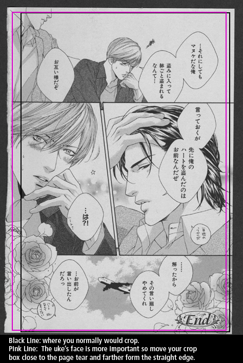
You don't always want to crop like there's a gutter on the cut side of the page. What if there's something important there? Instead, crop like the gutter's on the other side of the page. In this image, the crop box has been moved closer to the cut side because the uke's face is more important. His face would also look squished to the edge of the page if you cropped it like normal (closer to his eye).
Also remember that a little rip isn't going to stop the cloning tool so don't sacrifice leaving something important out because of a tear at the corner.
You might need to use unsharp mask after resizing. You don't need to sharpen too much (Click the Preview on and off to help). FILTER -> SHARPEN -> UNSHARP MASK. Roughly...Amount: 18% Radius: 1.8 pixels Threshold: 2 levels.
Be aware that LCD monitors are sharper than CRTs and that if a CRT hasn't had time to warm up, the screen will be blurrier (roughly 20 minutes to warm up). It's best to do this after you're done typesetting the entire chapter since there isn't an unsharpen mask adjustment layer. Make a copy of your PSD folder and then sharpen those files.
Say I resize to 700px and I get moiré patterns. Resize to 75% first, then resize to 700px. Okay, moiré patterns fixed but now I have scratchy lines. Resize to 90%, then 80%, then 75%, and finally 700px. It can go either way, but resizing to 90%, 85%, and then 75% should fix both moiré and scratchy lines. If you have to choose between moiré patterns and scratchy lines, fixing the moiré pattern is more important.
S-IPS Screens*
I have never used an Apple monitor without OS X running so it might be their color utility that corrects the colors and not the monitor. As far as I know, most Apple monitors are S-IPS screens, which have awesome viewing angles and less color banding. Samsung, Viewsonic and Dell also makes monitors with S-IPS screens but they don't like to share that. If you're looking for an S-IPS screen, Hardforums has a list of S-IPS screens in production. It's an older thread, but it's also a good forum for researching before you buy anything.
If you're on an LCD, adjust your black light so it's as bright/dim as it would be if you were editing. In other words, you don't want your backlight to be so bright it gives you a headache, but you don't want it so dim that your whites are a neutral gray. Don't forget to take lighting of your room into consideration. Your monitor will look brighter at night, and dimmer during the day. Personally, I never do my levels at night because it hurts my eyes (my LCD doesn't let me adjust the backlight).
Black Test #1
This test shows a square that starts out black (0,0,0) and each frame shows a lighter tint. With a good monitor and lighting, you should see the change from step 1 to step 2 (so from solid black to RGB 2,2,2). If you still cannot see the difference between the page's background and step #4 (RGB 3,3,3) your monitor is way too dark and needs to be adjusted before leveling your scans
Black Test #2
This is another test that compares lighter squares to a solid black background. With a good monitor and lighting, you should be able see square #1, but square #3 will be easy to see without any eye strain. If you can't see the entire top row (squares one through five), your monitor needs to be adjusted before leveling your scans.
White Test
Not as important as the black but still important enough to check. 250 should be pushing your ability to see the gray squares. 251 through 253 might be visible but very strenuous on your eyes to look at. If you can't see 248, your monitor needs to be adjusted for whites.
Viewing Angles Test
With an LCD, your levels can also be effected by your screen's viewing angles. To see an extreme example of this, maximize your browser window with the blue on the test and look at your monitor from the side of the screen--you're probably seeing a lot of purple now (or if you have a good screen, you're still seeing blue). Now without going to the extreme, look at your monitor straight on. The really crappy screens will have a different color at the top, middle and bottom. A neutral gray is color to test this on (my first LCD went from red, to gray, to purple O_O). If your colors are different in the corners of your screen, this is because of light leakage, not viewing angles.
Why are viewing angles important? It can throw off your leveling but it'll also strain the hell out of our eyes when you're looking for dust (lots of squinting). Bad viewing angles can even make your blacks look metallic.
Default Monitor Settings VS Custom Settings
These are comparison photos of three images. One is a piece of digital artwork, the other two are Togainu no Chi Covers.

Every time I start my computer I'm reminded of the default settings for my monitor (before my video card settings kick in). It's not manga artwork but I think it's the best example of the high contrast that LCDs have by default.

Here's a crop of the OMEKASHI cover. The shadows in Akira's hood look black, when in reality they're not and the small triangular shape at the bottom (the beginning of Akira's tie) is actually darker than the hood's shadows.

This is the cover of A3. A3's uses unusual paper for a doujinshi cover--it very nice, thick and matte--making it a pain in the ass to level. I wouldn't make this cover much darker than it appears in the default settings, but in reality, it looks like it does in my custom colors. With scanlations, this type of scenario is when you'll run into the "Blacks that aren't Black" problem.
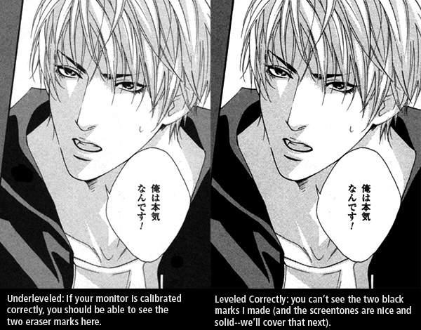
I've make two black marks on the left image. This is what readers will see if you erase or draw with black on underleved blacks. The right image is what your levels should look like.

I've pointed out the black marks in case you can't see them (calibrate your monitor!)
Beginners
1) Select the WHITE POINT eye dropper and click on all the little gray dots until they're gone (don't grab from the page gutter or you'll over level the page!)
2) Select the BLACK POINT eye dropper and click on a solid black area. Most of the gray dots will go away in one click. You'll probably have to click on the almost black dots one more time.
Experts
Drag the black and white arrows to where it starts to curve inside. Adjust the midtone if necessary. I can't really explain this. People who would like to learn this, I suggest seeing Forever-More's editing tutorial. The eyedropper method works for me. Very rarely do I have to adjust the midtones afterwards because they're too dark.
Scry's Method (Screentones Over Dust)
I personally like to use the white and black point droppers to get my black and white levels. But at the same time, I don't use the white dropper to remove all of the dust because it'll wash the screentones out. I try to level my whites without washing the screetones out (this also leaves me with a fair amount of dust to dodge out before I send it off to QC). Occasionally, I'll open the levels window again and adjust the midtone arrow to strengthen the screentones.

Here's what'll look like when you're zoomed in and leveling:
Raw .
Overleveled .
Underleveled -- smooth tones .
Midtones - darker tones
IMAGE -> ADJUSTMENTS -> REPLACE COLOR. With the "Eyedropper Tool" select the dominate yellow spot on their face (you want the midtone, not the dark orange and not the bright yellow). These settings will change depending on the image, but you don't want Fuzziness at 200: Fuzziness: 155. Hue: -18.
- Zoom into 200% If you can't see the dust at 200% don't worry about it. No one else will see it either.
- Choosing the appropriate brush size helps keep the dodge tool from going over the line work more than it needs to.
- Hitting line work with the dodge tool will make them thinner and lighter so avoid dodging them.
- When you're close to screentones, it's better to use the dodge tool by clicking so you don't over level.
- When you're close to line work, it's better to hold the button down.
- Depending on what you're dodging, it's better to have hardness at 100% or at 0% (screentones you want 0% hardness--the fuzzy looking brush).
For tricks on cloning dot screentones, check out the Photoshop tutorial.
There's a checkbox with the clone tool called "Use All Layers" at the top of the window. When this is clicked, you can work on a transparent layer and still clone from another layer (if it's not clicked you'll clone nothing). This is good for when you have to re-draw something that has a screentone inside of it. You can draw the line work on one layer and put the cloned screentone on a layer below it (so the cloned screentone won't go over the line work you drew in). This way, if you screw up you can just delete the new layers and your background layer won't be affected.